How to create on-brand blog visuals at scale using AI

Table of contents
1. Start with a visual identity your AI tools can understand
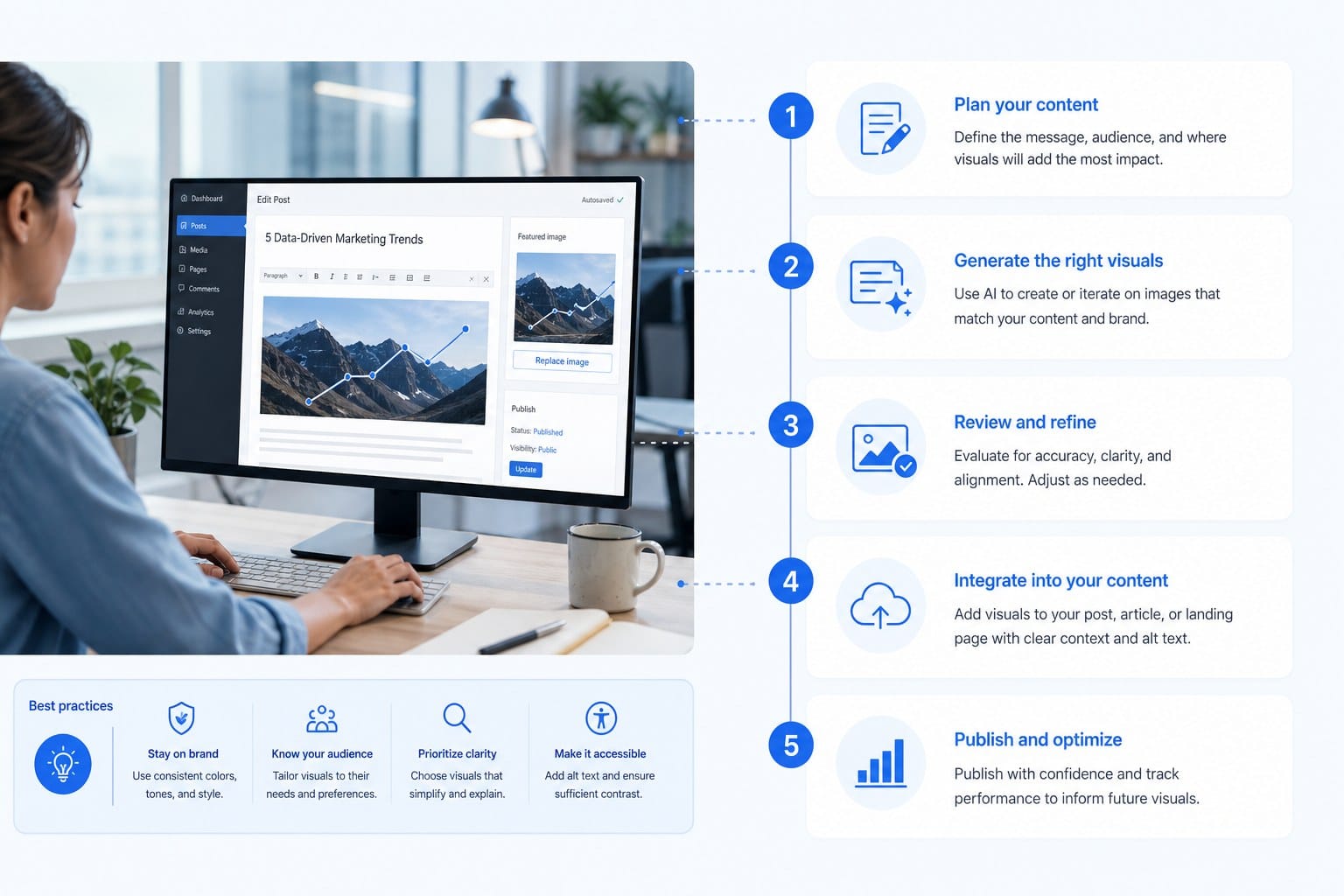
2. Build a repeatable process for generating and reviewing visuals
3. Integrate visual generation into your content publishing workflow
If you run a blog for a growing brand, you already know that publishing consistently is only half the battle. The other half is making sure every post looks like it belongs to you. Visuals are a big part of that. Readers form an impression of your brand the moment they see your featured image, your inline graphics, or your social preview card. If those visuals feel generic or mismatched, it chips away at the trust you are trying to build, no matter how good the writing is.
The good news is that creating ai generated on brand blog visuals no longer requires a design team, a big budget, or hours of work per post. AI tools have matured enough that a solo blogger, a startup founder, or a small marketing team can produce consistent, polished visuals at scale. But scale without a system is just noise. You need a clear approach so that every image you generate actually reflects your brand instead of looking like a random stock photo substitute.
In this guide, I am going to walk through how to build that system, from defining your visual identity in a way AI tools can actually use, to integrating image generation into your content workflow so it does not slow you down.
Start with a visual identity your AI tools can understand
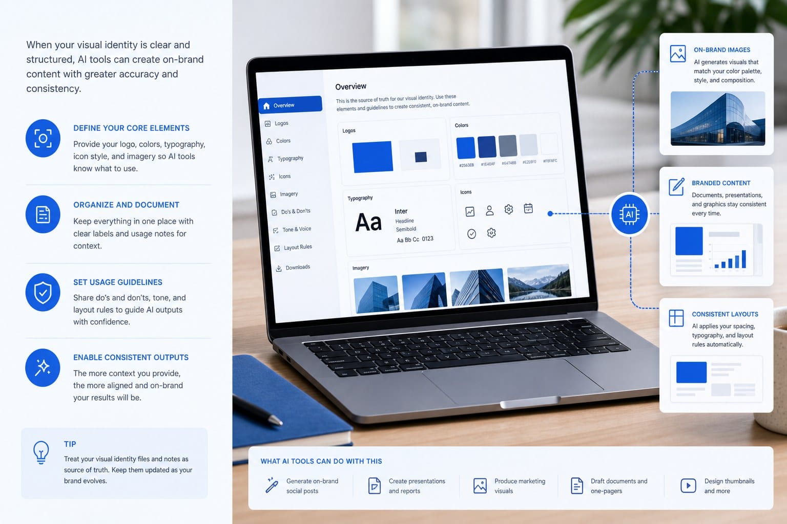
Before you generate a single image, you need to translate your brand into a format that AI tools can work with. Most people skip this step, and it shows. They type a vague prompt, get a decent-looking image, use it, and then wonder why their blog feels visually inconsistent after six months.
Your visual identity has a few core components: color palette, typography style, mood or tone, and a consistent subject matter or illustration style. You probably have some version of this already, even if it is just a logo and a website color scheme. The goal is to take what you know about your brand and turn it into reusable prompt language and reference inputs that you feed into your image generation workflow every single time.
Let's start with color. Most AI image generators, including Midjourney, Adobe Firefly, and DALL-E 3, accept color descriptions in plain language or hex codes. If your brand uses a warm terracotta and cream palette, write that down exactly. Something like "warm terracotta background, cream foreground elements, no cool tones" becomes a reusable snippet you paste into every prompt. You can even save it as a template variable if your workflow supports that.
Next, think about illustration style. This is where brands diverge the most. Some brands want photorealistic visuals. Others want flat vector-style graphics. Some go for an editorial ink-drawing look. Others prefer abstract gradients. There is no wrong answer, but you need to pick one and stick with it. When you are generating ai generated on brand blog visuals consistently, style drift is your biggest enemy. If post one uses photorealistic office scenes and post ten uses cartoon characters, your blog looks like it was written by five different people.
To anchor your style, build a small reference library. Collect five to ten example images that already look the way you want your blog to look. These might be images you have licensed, screenshots of illustrations you admire, or even your own past work. Many AI tools let you upload reference images to guide the output. Even when they do not, studying your reference library before writing prompts helps you describe the style more precisely.
Here is a practical exercise. Write a one-paragraph description of your ideal blog visual. Include the mood (professional and calm, playful and bright, serious and editorial), the color range, the subject matter (people, abstract shapes, product photography, data visualization), and the level of detail (simple and clean, rich and complex). Keep this paragraph somewhere easy to find. You will use pieces of it in almost every prompt you write.
Finally, think about typography on visuals. Some blog headers include text overlays, pull quotes, or labels. If you do this, decide on a font pairing now and stick to it. Many AI image generators do not render text reliably, so for text-heavy graphics, you will want to generate the visual background with AI and then add text in a design tool like Canva or Figma. Decide in advance which visuals get text overlays and which do not, so your process stays consistent.
When you have your color snippets, style description, reference images, and typography rules documented, you have what I call a visual brief. It is a short, practical document, maybe one page, that tells any AI tool (or any human designer) what your brand looks like. This brief is the foundation of everything else. Without it, you are just guessing.
Build a repeatable process for generating and reviewing visuals
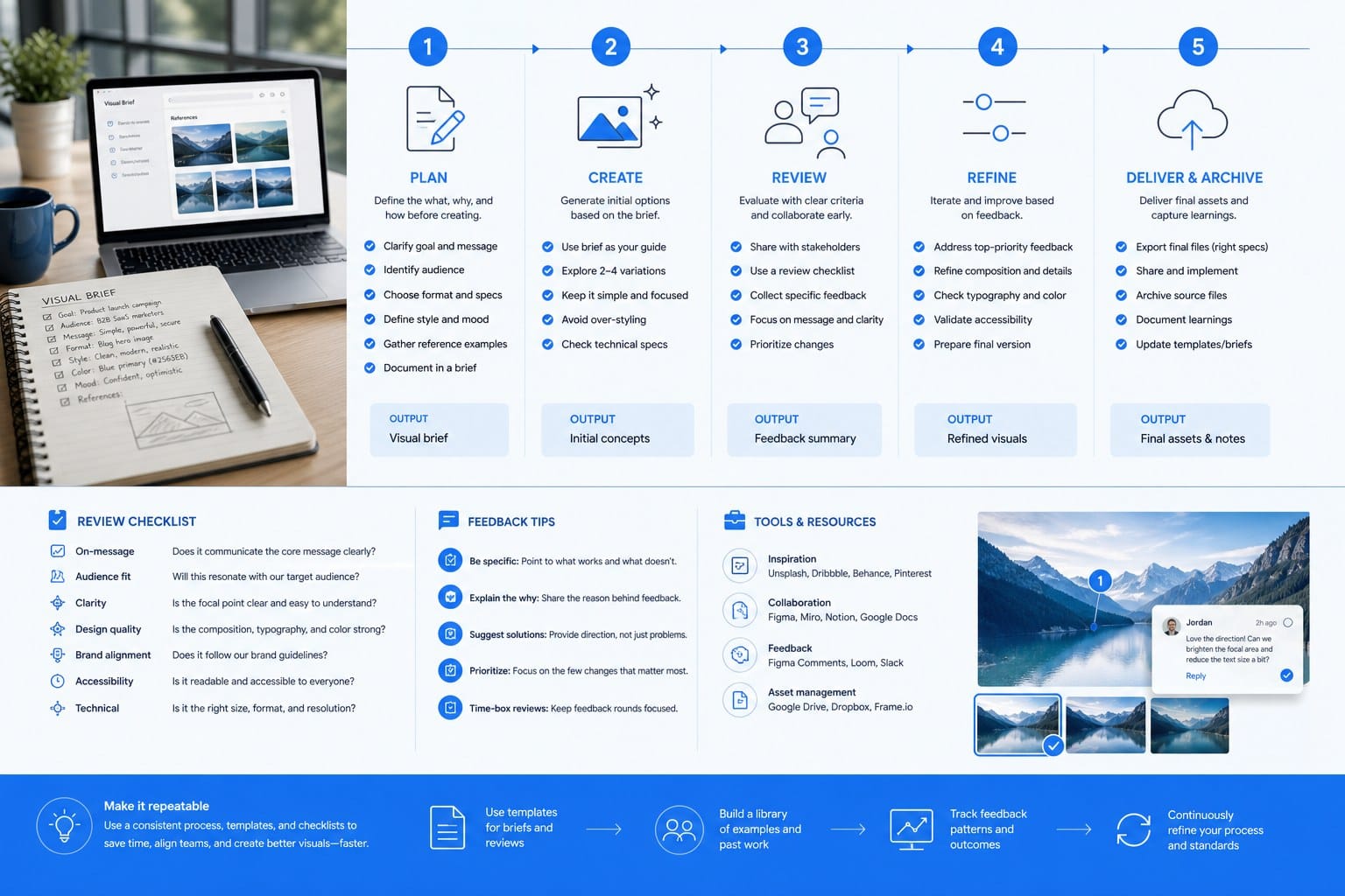
A visual brief is only useful if you actually apply it every time you need an image. The challenge with scaling blog content is that the image generation step often gets rushed or skipped entirely when you are trying to publish fast. The solution is a repeatable process that fits inside your existing content workflow rather than sitting outside it as a separate task.
Let me walk through the process I recommend for anyone producing more than a few posts per month.
Step one is to generate your prompt before you write the article, not after. Most writers think about visuals last, but that creates a bottleneck. When you plan your article, write a one or two sentence image prompt at the same time. You know the topic, you know the tone, and you have your visual brief in front of you. A prompt written at the planning stage is usually better than one written in a rush before publishing. It might look something like this: "A clean, minimal illustration of a person reviewing a content calendar on a laptop, warm terracotta and cream color palette, flat vector style, no text, soft shadows." That prompt was written in about thirty seconds using the visual brief elements from the previous section.
Step two is to use a consistent tool and save your settings. Different AI image generators produce different default aesthetics. Midjourney has a particular look. Adobe Firefly skews toward certain photographic styles. DALL-E 3 handles plain language prompts well. Pick one tool as your primary generator for blog visuals and learn its quirks. Save your most effective prompt templates inside the tool if it allows that, or keep them in a shared document. The goal is to reduce the mental load every time you need an image so you are not starting from scratch.
Step three is to generate multiple options, not just one. Most AI image generators let you produce four or more variations in a single request. Always do this. You will almost never pick the first image. Generating four options takes the same amount of time as generating one, and it gives you real choices instead of forcing you to settle. From your four options, pick the one that best matches your visual brief, and discard the rest.
Step four is a quick brand-consistency review before you use the image. This sounds tedious, but it takes about twenty seconds once you know what to look for. Ask yourself three questions. Does the color palette match my brand? Does the illustration style match the rest of my blog? Would a reader who has seen my other posts recognize this as part of the same brand? If the answer to any question is no, either generate more variations or adjust your prompt and try again. Do not skip this step when you are in a hurry. Inconsistent visuals compound over time.
Step five is to store your approved images in a structured library. This matters more than most people realize. A folder with 200 images named "image_final_v3.png" is not a library, it is a mess. Use a naming convention that includes the article title or topic, the date, and the image type. For example: "content-calendar-guide_2025-06_featured.png". This makes it easy to find images later, reuse similar visuals for related topics, and audit your visual consistency across the blog.
One more thing worth mentioning: you will occasionally generate an image that looks great but has a subtle problem. Hands with too many fingers, text that is garbled, a face that looks slightly off. Train yourself to spot these quickly. They are common with current AI image tools and they undermine the professional look you are trying to build. When you see one, generate again rather than trying to fix it in post.
If you are thinking about how this process fits inside a larger automated content system, it helps to look at how publishing workflows handle this kind of repeatable task at scale. How to scale blog content without hiring writers covers the broader workflow question and gives useful context for where image generation sits inside a fully automated content pipeline.
The key insight with any repeatable process is that consistency is a habit, not a talent. The bloggers and marketers who produce visually consistent content at scale are not more creative than everyone else. They just have a documented process they follow every time, and they protect that process from shortcuts even when they are in a hurry.
Integrate visual generation into your content publishing workflow
Having a great process for creating ai generated on brand blog visuals only creates value if those visuals actually make it into your published posts reliably and efficiently. This is where a lot of independent bloggers and small marketing teams lose the gains they made by using AI tools in the first place. The image generation step becomes a manual handoff that breaks the workflow or adds a delay that kills publishing momentum.
Let me explain how to close that gap.
The first thing to understand is where your blog is published. Different CMS platforms handle images differently, and the right integration strategy depends on your platform. Ghost, for example, has a clean API that allows images to be uploaded and attached to posts programmatically. WordPress has similar capabilities through its REST API. If you are publishing to a platform that supports API-based publishing, you can automate the image upload step almost entirely. The image gets generated, uploaded, and attached to the post without you manually dragging and dropping it into an editor. If you are curious about which platforms handle this kind of automation most cleanly, Best CMS platforms for automated content publishing breaks down the options in detail.
For teams and individuals who are not yet at full automation, the next best approach is a structured handoff document. When your article is drafted, you include the image prompt, the approved image file path, and the placement note (featured image, inline after section two, social preview) all in one place. This makes the publishing step fast and eliminates the common mistake of publishing a post with a placeholder image or a wrong image.
Let's talk about the different types of visuals you need for a typical blog post and how to handle each one efficiently.
The featured image is the most important. It appears at the top of the post, in your RSS feed, and when the post is shared on social media. This image needs to be strong, on-brand, and clearly connected to the article topic. Because it is so prominent, this is the image worth spending the most time on during the generation and review step. Budget for generating eight to twelve variations before you commit to one.
Inline images are used to break up long sections of text and illustrate specific points. These can be simpler and more abstract than your featured image. A flat illustration of a workflow diagram, a simple graphic of a concept, or an abstract texture that matches your brand palette all work well. Because these images are lower stakes, you can move faster on them. Two to four variations is usually enough.
Social preview images, or open graph images, are what people see when your post is shared on LinkedIn, X, or other platforms. These often have text overlays with the article title and your brand name. As I mentioned earlier, use AI to generate the visual background and add text in a design tool. Keep a template file for this so you are only swapping the background and the title text each time. This step can take as little as three minutes per post once the template is built.
Now, let's talk about prompt quality at scale. When you are generating visuals for multiple posts per week, prompt fatigue is real. You start reusing the same prompts, the images start looking identical, and your blog begins to feel repetitive. The fix is a prompt variation system. Write a core prompt template for your brand and then create a list of ten to fifteen scene variations that fit your content topics. For a marketing blog, that might include scenes like a person reviewing analytics, a team in a planning session, a laptop with a graph on screen, or an abstract representation of growth. Rotate through these variations systematically rather than inventing new prompts every time. This keeps variety alive without breaking brand consistency.
Another useful tactic is batching. Instead of generating images one at a time as you write each post, set aside one session per week to generate images for all the posts in that week's publishing queue. Batching reduces context switching, helps you maintain visual consistency because you are reviewing all the images together, and speeds up the individual publishing step for each post. If you are running a 30-day content calendar, you can even batch images monthly and get ahead of your publishing schedule.
For those who want to understand how visual production fits inside a long-form content strategy, it is worth noting that longer, deeply researched articles tend to need more visuals than shorter posts. The reasoning behind this connects to how readers engage with content at different lengths, which Long-form blog articles vs short posts: what actually ranks explores in full. A 3,000-word post might need a featured image, two to three inline images, and a social preview card. A shorter post might only need a featured image. Building this into your visual production process means you are not caught off guard by the scope of work.
Finally, audit your visual consistency every 90 days. Set a calendar reminder, open your blog, and scroll through your last 30 or so posts looking at the images only. Ask yourself: do these look like they belong together? Is the color palette holding? Is the style consistent? If you spot drift, trace it back to where it started. Usually there is a specific week where a deadline pushed you into shortcuts, and the audit helps you identify and correct that pattern before it becomes the new normal.
The brands that build real authority through content are not necessarily the ones with the biggest budgets or the most writers. They are the ones that show up consistently with quality that readers can recognize and trust. Visuals are a major part of that recognition. When your images look like they belong together, they tell readers that someone cares about this blog, that it is maintained with intention, and that the content inside is probably worth reading. That trust is hard to build and easy to lose, but a solid visual system makes it much easier to protect.
Ready to take the next step?
Blogtude handles the full content workflow for growing brands, including 30-day content strategy, deeply researched long-form articles, on-brand visuals, and automatic publishing to Ghost and other CMS platforms. If you want consistent, professional blog output without building a team or managing every step manually, visit blogtude.com to see how it works.